Thursday, June 30, 2011

Google Earth: Your World in 3D

Today, we’re unveiling a totally redesigned Your World in 3D website. If you’re new to geo-modeling -- the term given to creating 3D buildings for Google Earth and Google Maps -- the Your World in 3D website has all the tools and info you’ll need to get up and running quickly. The new website showcases several examples of what fellow modelers are building and will help connect with other geo-modelers around the world.

So that’s the what, here’s the why. Five years ago, Google acquired a Boulder-based startup called @Last Software, which was making waves in the architectural world with their 3D modeling software, SketchUp. Google had an ambitious idea to add a 3D model of every building on the planet to Google Earth, and SketchUp was a tool up to the task. Not only that, by opening SketchUp to a wider audience, users would have the opportunity to help build a virtual mirror of their world.
Times Square showcases some of the very first user contributed models

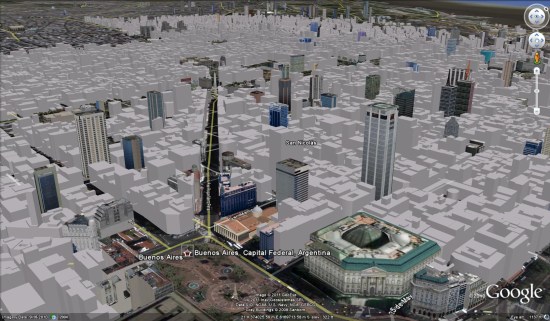
Today, the 3D virtual world is in full bloom: hundreds upon hundreds of villages, towns, and cities have been added to the 3D map representing hundreds of thousands of 3D buildings from every corner of the globe -- truly, a testament to the power of open collaboration.

In the intervening half decade, we’ve introduced several new ways of adding buildings to the 3D map, including Google Building Maker and the Cities in 3D program. And you may have noticed 3D buildings surfacing on Google Maps and Google Maps for mobile as well. With so many different ways of creating and viewing 3D models, we realized we needed a destination that would demystify the process of geo-modeling,

Enter: the new Your World in 3D website. We call the website Your World in 3D because it is you, the user, who is helping build this virtual world, and perhaps more importantly, it is you who is finding innovative and surprising ways of using this data.
Your World in 3D has been redesigned from the ground up

Why geo-model? When asked, most geo-modelers say they do it because geo-modeling is just plain fun, but building your town in 3D can also be a great way to show civic pride and encourage tourism for your town. It can also provide an interactive way to promote your business or contextualize the urban planning. 3D modeling has also been used in crisis response situations as we saw in the grassroots modeling effort that happened after the earthquake in L’Aquila, Italy.


Wednesday, June 29, 2011

SketchUp Real-time design

SketchUp allows you to model in real-time which is a feature you use in meetings with clients, stakeholders and other consultants on the design teams.

This capability came in handy on a project  were working on with Community Transit in Everett, WA to design concepts for a series of Bus Rapid Transit (BRT) Stations. After our first workshop, we came out with a couple of concepts which we refined and presented using SketchUp. One of these concepts ended up being built as close as possible to the original design. By modeling and presenting in SketchUp, the client felt ownership over the design and had a better understanding of the challenges associated with construction. Initially, they wanted something “wavy” or “fluid”, but using SketchUp, it was effective to show that a two-directionally curved canopy is not terribly easy to build, especially with a limited budget and a tight schedule.
3 options developed for BRT stations. The bottom option was built in 2010.

Later in 2007, we designed a Pedestrian Bridge in Tempe, AZ at the Town Lake. In meetings with the client, the engineer T.Y. Lin International, and the artist Laurie Lundquist, it was highly effective to present proposed concepts for the bridge directly from SketchUp using a laptop and a projector. This allowed the team to engage in real-time with the bridge concepts and study the relationship with the neighboring Tempe Center for the Arts, which was a sensitive issue for this design. The viewpoints at the different piers of the bridge were easy to visualize using a series of Scenes in SketchUp. The model also allowed real-time analysis of aspects like transparency, visibility and shading. I then created a rendering of the bridge using Adobe Photoshop, which was helpful in creating the reflection in the water.
SketchUp was also a great tool to do shading studies for consideration of different shading structures. A shading sail, developed together with local artist Laurie Lundquist, integrated with the flow of the bridge and proved elegant and functional.

Toward the end of the design process, SketchUp actually played one more unique role. While I was determining the right angle for the 2 bridge arches to touch each other at the top of each arch in SketchUp, the 2 arches suddenly overlapped (as I was working within the component, both arches were turning simultaneously), and voila, a unique crossing arch appeared, which we introduced as our preferred alternative. Today, the bridge is currently under construction.
A shading study
The bridge under construction

As recently as a couple of weeks ago, I used Match Photo for the first time in a meeting with a prospective client for station design and design of alignment options for another Bus Rapid Transit (BRT) line. I created just one model to demonstrate 3D modeling, show 3D sections of the streetscape and show a Match Photo context study.
Different configurations for street lanes

By switching Layers on and off and clicking on saved Scenes, we were able to show how future transit oriented development (TOD) would positively impact the streetscape. The different lane options were also placed in different Layers and Scenes, so we could show their respective impact with one click on the Scene tab. At the request of the client I was able to change the station configuration in real-time, which translated immediately to the Match Photo Scenes.
BRT station renderings

I want to conclude by saying what I appreciate most about Sketchup is that it’s highly intuitive and quick enough that it enables real-time modeling, which is a real asset in presenting and shaping public projects that usually include a significant amount of community engagement.

Native Driver

 
NativeDriver is an implementation of the WebDriver API which drives the UI of a native application rather than a web application. I am happy to announce that the Android version is available for download and we are welcoming all users and contributors. We are hosting on Google Code (http://nativedriver.googlecode.com/). An iPhone (iOS) version is under development and will be available soon.

WebDriver exposes browser functionality as a clean, object-oriented API, and Google uses WebDriver to test web applications on many platforms. (For an introduction to WebDriver, see this blog post.)

You are probably wondering why anyone would use the WebDriver API to test native applications. Our reasoning is:
  • user interactions with a native application and a web application are essentially the same: click, type, switch window, read text
  • test writers will have to write the same test for each platform they want to support
  • no one wants to learn yet another API
  • WebDriver already has a user base and a tool ecosystem that can migrate easily to a new API if it is WebDriver-like
  • therefore: let’s re-use our favorite UI testing API
NativeDriver is our attempt to apply WebDriver’s simplicity and success to native applications. It extends the WebDriver API in a few key places, and re-interprets the existing API for native applications.

Here is some code from a NativeDriver test against the Google Maps Android app (the test can be seen in action in this video):
AndroidNativeDriver driver = new AndroidNativeDriverBuilder()
.withDefaultServer()
.build();
driver.startActivity("com.google.android.maps.MapsActivity");

// Open the Places activity by clicking the places button
// (to the right of the search box)
AndroidNativeDriver btn
= driver.findElement(By.id("btn_header_places"));
btn.click();

// Dismiss the Places window
// Equivalent to pressing the Android Back button
driver.navigate().back();

// Rotate the device to show the UI in landscape mode
driver.rotate(ScreenOrientation.LANDSCAPE);
 
Except for the startActivity method, and the use of a builder object to create the driver, all the API calls made are standard WebDriver API calls. Creating the driver with a builder is necessary because the driver can also be set up with an Android Debug Bridge (ADB) connection.

Android NativeDriver uses Instrumentation to monitor and manipulate the application under test. Instrumentation is a standard feature of Android but it has some limitations. For instance, it cannot drive UI which is part of another process. (If it could a malicious application could hijack the device.) This is where ADB saves the day. The ADB is a connection from outside the device and is not tied to a particular application, so with it we can inject events across applications. ADB also made it possible to add screenshot support, and we plan to utilize it in new ways as NativeDriver matures. This is one way Android NativeDriver tests are more powerful than standard Instrumentation tests.

You can try out Android NativeDriver right away with the tutorials for running a sample test or instrumenting your own application. You may also want to join the users or developers
mailing list.

Monday, June 27, 2011

Bing Maps Interactive SDK (AJAX 7,0)

Bing Maps Interactive SDK (AJAX 7.0)

Bing Maps v7 Interactive SDK

New Features:
  • Create map with map options > Map with inertia intensity: Try varying the inertiaIntensity parameter in the source code window. Set it anywhere between 0 and 1, hit run, and then see what happens when you click and drag the map.
  • Create map with map options > Map with background color: Pull the fully zoomed out map down to see the background color and hit the "Run" button. This shows off the new backgroundColor option and gives you a random color every time. Try typing in your own RGB values and see what you get.
  • Get user location > Get location: If the browser on your phone or PC supports the W3C GeoLocation API, then try out the new getCurrentPosition method to easily find yourself on the map. (Note that the accuracy of this function varies depending on the capabilities of the requesting client. For example, desktop users may see lower accuracy while mobile users see much higher.)
  • Loading dynamic module > Load module - clustering: This shows you how you can use the new module loading methods to register and load your own custom modules (or modules built by other Bing Maps developers).
http://www.bingmapsportal.com/ISDK/AjaxV7

Does 3D suck?

I was on a road trip holiday the week before last and before I left I read this James Fee blog post he has an image of Godzilla walking into electricity pylons with the tag line 'Google Earth keeps bumping into things trying to work out why it is here'. This led me to ruminate and I quickly wandered from James' post about GEarth enterprise to the more general 'what is Google Earth good for?'. I considered features such as
  • layer control
  • zooming
  • time animation
but, powerful those these are for visualisation, they are all also available in Google Maps and are just as much 2 as 3D*. What truly sets a virtual globe apart from web mapping is 3D and this is what I ended up ruminating on most of all:
Current Uses of 3D. I don't have much time for fancy graphics, so beyond cool looking 3D flights, what does 3D in Google Earth actually add to understanding at the moment? There are several examples:
  • 3D buildings: Populating a city with 3D models adds a lot of value to urban geography, you can see what a skyline looks like or enhance what you've seen on a walk through a foreign city by revisiting your walk in GEarth later. 3D trees are available in GEarth too but I don't think they're nearly as useful as the buildings.
  • Mountains and Valleys: When considering topics where topography is important a 3D view can add understanding. The Appalachian Mountain removal project is a perfect example as the location of the mines on the tops of the mountains is key to understanding the problem.
  • Earth Science Models: 3D models of large scale processes on our planet such as subducting plate margins and hurricanes can add understanding, see the project I'm working on with Old Dominion University and others.
  • Streetview and Panoramas: Streetview and gigapan panoramas come close to giving a realistic 3D view of a scene. Streetview enables you to move from location to location whilst a gigapan allows you to zoom in on interesting features of the panorama.
IMHO the Streetview/Panorama example is the most important of these. However, the 3D visualisations discussed above are far less common on the web than the uses of 2D like data mashups, real time maps and map related infographics.
Future Uses of 3D: But what is available now may not be the whole story. Can we imagine a use for 3D in the future that is the 'killer app?'. Here's some possible future uses:
  • Real 3D Earth Science Models: Currently the way to present a 3D geology model is to slide it out of the ground to give the viewer the idea that its come from underground. It works pretty well but it would be good to be able to fly beneath the earth's surface and show models in their real situation.
  • Thematic 3D data: I've frequently discussed 3D thematic maps on this blog, mostly unfavourably. However, the 'Obama: One People' visualisation I discuss here looks to me like it really adds something, I think 3D thematic maps could be useful visualisations but they remain unproven - no one has done user tests on them.
I can foresee that Streetview and similar panoramas will improve in time with real time 360 views and developments like Microsoft's streetslide helping make them more usable. Beyond that, neither of the topic areas listed above is convincing as a killer app.
2D Dominance: So I don't think 3D is ever going to topple 2D as the best way to visualise spatial data. This may seem a little surprising, we live, work and move about in 3D all the time, why won't 3D will become more common? What this point misses is that we also symbolise all the time too, a road map is far more useful than satellite imagery for navigating with because it strips out everything unnecessary (trees, people, greenhouses) and leaves exactly the information we need: roads and junctions as symbols. Usually the best visualisation is the simplest one possible so if a spatial problem can be visualised in 2D its best to do it that way. Especially if you are rendering the map on a small screen smart phone. We live on a planet that were it reduced to the size of a billiard ball would be smoother than any in the world so it really isn't surprising that most of our spatial data can be effectively reduced to 2D.
*of course you can now pull 3D GEarth into a Google Maps but I'm not really focussing on the technology here.

Sunday, June 26, 2011

Google Map Scrolling


Tourism New Zealand has implemented a very clever and striking website using Google Maps in conjunction with a series of related background images.

As you use scroll through the New Zealand 100% Pure website the background images change to create some impressive effects. The scrolling images are used to create animated clouds moving across still landscape images or to provide a narrative, for examples as the people portrayed in the images move around.

The effect of the scrolling images is hard to explain, so you really need to see it yourself on the 100% Pure website. When you visit the page notice how the Google Maps inset changes as you scroll the page to reflect the location of the current background image shown on the page.

New Zealand 100% Pure

Saturday, June 25, 2011

The New parking fot MINI

Published with Blogger-droid v1.7.2

From The Tallest Mountain to the Deepest Ocean Trench

tallest-deepest.jpgKarl Tate over at OurAmazingPlanet has created an amazing infographic showing the highest heights and the deepest depths of our planet. You can see a thumbnail view of the graphic on the right, but I encourage you to view the full image on their site.

Of course, all of these amazing features on our planet look excellent in Google Earth! Here is a list of the places that are mentioned in the graphic so you can go see them for yourself.

Mount Everest | KML

K2 | KMZ

Aconcagua | KMZ

Mount McKinley | KMZ

Kilimanjaro | KMZ

Mount Elbrus | KML

Vinson Massif | KMZ

Puncak Jaya | KMZ

Lhasa | KMZ

South Pole | KMZ

Denver, Colorado | KMZ

Burj Khalifa | KMZ

CN Tower | KML

Empire State Building | KML

Great Pyramid of Giza | KMZ

Statue of Liberty | KMZ

Deepwater Horizon oil rig | KML

Grand Canyon | KMZ

Wreck of the RMS Titanic | KMZ

Puerto Rico Trench | KMZ

Mariana Trench | KMZ

We live on an amazing planet, and Google Earth is such a great way to explore it all. Thanks to Karl and OurAmazingPlanet for putting together that graphic.

Friday, June 24, 2011

The News in Google Summer of Code


The organizations give a brief description of their project and the tasks the students will be working on this summer.
LanguageTool is one of the very few open source style and grammar checkers. It tries to find errors in a text that a spell checker cannot find. This works by matching the text against pattern rules. If there's a rule for the error, it can be found, if there is no such rule, then it can not be found. There's also the risk that a pattern rule matches text which is actually correct, so the user would get a false alarm. This is where our two student projects come in: one project will be adding more rules by reusing rules from other open source grammar checkers, the second student will develop a way for us to test rules that are still in development against a large amount of text. This way we can fix the false alarms before a release.

By Daniel Naber, Organization Administrator for LanguageTool

----------

The 'Computational Science and Engineering at TU Wien' project develops software for the simulation of a plethora of physical phenomena. Example applications range from fluid dynamics, to the propagation of high frequency waves and electronic devices such as lasers and transistors, to the mechanical stability of human bones.

Our students will be working on the following: Cristina Precup will design a constructive solid geometry input file format that allows users to conveniently specify two-dimensional geometries using boolean operation on primitives such as circles and rectangles. Our second student, Jorge Rodriguez, will investigate a convenient approach to parallelize the volume meshing step for meshes of considerable size. Markus Wagner, our third student, will work on using graphics processing units (GPUs) to accelerate solving the large systems of equations that describe certain physical phenomena.

By Karl Rupp, Organization Administrator for Computational Science and Engineering at Tu Wien

----------

Learning Unlimited works with over 900 college student volunteers to create educational programs for over 6000 middle and high school students across the US. Our programs invite pre-college students to choose between hundreds of topics like quantum mechanics, urban design, Shakespeare, or street drumming and create an environment where it is socially acceptable to share your excitement about learning. Our open source software automates a lot of the processes for running these programs so that college students can focus on making an awesome weekend for younger students.

We are mentoring two promising students sponsored by Google Summer of Code. Jordan Moldow joins us from MIT, home of the oldest and largest LU chapter; he will be implementing a new student registration system that is easier to use and gives directors more flexibility in implementing application and lottery processes. Jordan is also planning to improve our application's data viewing and export capabilities. Vishal Dugar, from the Birlani Institute of Technology and Science in Pilani, India, has joined us to implement a custom forms builder. This system will act somewhat like Google Forms, but with backend storage in dynamically generated Django models and the ability to link form fields with model fields in the existing schema. These contributions should substantially enhance the ability of our volunteers to coordinate and support unique educational events at a growing number of universities.

By Daniel Zaharopol, Organization Administrator for Learning Unlimited
These are just a few of the new organizations participating in the Google Summer of Code this year. Please check back next Friday when we showcase additional new organizations. For a complete list of the 175 organizations participating in the Google Summer of Code please visit our program site.

Thursday, June 23, 2011

The Pitney Bowes Business Insights Conference


There was a ton going on given the new focus from Pitney Bowes on their location intelligence division.  Here are some highlights:
  • MapInfo 11 — Should be out by the end of the month (if not sooner).  I liked that there were no “goes to 11” jokes (at least none that I noticed) given that stopped being funny at least 20 years ago.  One new features in MiPro that should be of interest to folks is that it will now be available  to run under a 64-bit operating system and take advantage of 4GB of memory.  Desktop GIS should take advantage of the great new hardware we’ve had for years and not be limited to what was expected in 1999, right?  I also noticed that OpenStreetMap will be available as a basemap (joining the Bing Aerial, Hybrid and Road layers).  Also the biggest frustration with me and MiPro has been fixed; working with tabular data is finally workable and could actually stop me from exporting data into other databases to work with it.
  • MapInfo Manager — This is a relatively new product at attempts to help you manage your spatial data.  The session was very well attended so it appears this is a huge want from the PBBI community.  Being browser based, MapInfo Manager seems to be a better choice for organizations to use than a traditional desktop application.  It also is INSPIRE compliant offering up CSW feeds to clients to use (including MiPro 10.5 or later).
  • MapInfo Spatial Server — I didn’t get as much time to spend on these sessions, but APB has a detailed rundown.  This will replace most of the legacy MapInfo server technology with a modern spatial server.  It is still very early in its implementation so we’ll need to keep an eye out on functionality as PBBI releases some demos and use cases.  Definitely something to watch.
  • Geosk –  While this was released last year, 2011 will be a big year .  PBBI is in the process of loading up their latest data to Geosk and has signed up Mentum as a Geosk Library customer and you’ll see their data on Geosk (as well as WeoGeo Market) very soon.   For data vendors, DaaS is critical for them to scale up.  Those who persist in sending out DVDs via snail mail will wither and die.
  • From MapInfo to Pitney Bowes — The new President of PBBI, John O’Hara, was definitely on message with MapInfo and Group1 being integrated into the greater Pitney Bowes strategy.  While I don’t think this means that PBBI is going to abandon the “traditional” geo market , but they are going to focus on Fortune 100 companies who want to to integrate spatial data into their business decisions.  PBBI was on message as being part of Pitney Bowes.  I liked the focus!
As with most conferences, I didn’t get a chance to sit in on every session and PBBI unlike many other geospatial companies does do a traditional plenary where they roll down each product in front of everyone.  Looking forward to seeing what happens in the next year with the new MapInfo Spatial Server and of course Geosk!

Wednesday, June 22, 2011

Better access to your content is better

Google Places makes it quick and easy for you to tell your friends, and the world, what you think about the places you visit.

And since your reviews are your reviews, we figured giving you access to all this content in one convenient way might be helpful. Now, when you visit your profile on Google Places (to find it, click on your picture in the upper left of the screen), you’ll find a link along the left that points to an Atom feed of all the place ratings and reviews you’ve created on Google. The feed address is known only to you, but you are free to share it however you want. So, go on, enjoy your data.

In addition to taking your Google Places ratings and reviews with you, we also thought it’d be useful if you could more easily rate and review on Google the places you’ve found elsewhere in your travels or on the web.

To do that, just find the URL of a public GeoRSS/Atom feed that contains place information you care about. This could be anything from a feed of your Foursquare check-ins to a My Map you may have created years ago. Paste the URL into the search box on Google Places. We’ll show you place cards that line up, as best as we’re able to determine, with the places in the public geo feed. Then, you can rate to your heart’s content.

By making it easier for you take your opinions with you and rate familiar places quickly, we hope you’ll find more places you love, no matter where you may have discovered them.

Esri REST API Could Be an OGC Standard


Now I’m sorry if I butchered that name, I don’t recall being briefed on what the API Is called these days.   It appears that over last weekend Esri announced that they were “giving” their REST API to OGC as a standard.  Big news if you ask me given that the OGC has just never been able to get an OGC REST Standard adopted.  Plus it might make more sense given that the Esri REST API is pretty damn awesome and you got to think that the OGC would rather have awesome over a committee standard that no one uses.

One curious outcome of this is that we could now have a JSON standard in OGC, in this case Esri JSON.  GeoJSON, despite the fact that almost everyone uses it, is a community standard  not an OGC one (like GeoRSS).  If the OGC adopts the Esri JSON standard in the REST API, we could finally have a JSON standard for the INSPIRE project   Brian Flood thinks it make sense and I tend to agree with him.  Bill Dollins isn’t so sure.

If this is all going to happen, we’ll see a couple things come out of this.  First off we’ll probably see Geoserver and Mapserver start supporting this standard  which means that Esri Desktop users can add these servers without having to use WMS or WFS.  It also may mean that clients such as QGIS, gvSIG and OpenLayers will have native Esri REST API 5 reading.

If OGC was an open organization, we’d probably know more.  Heck, something to talk about at the UC next month, right?

Saturday, June 18, 2011

Tracking performance with HTTP Archive

Google put a lot of effort into making the web faster. To understand the impact of their work, we need to track the speed of the web over time. HTTP Archive allows us to do that.

HTTP Archive generates regular reports illustrating trends such as page size and Page Speed score of the top pages on the web. Interested users can download the raw dataset for free, modify the source code to perform their own analyses, and unearth valuable trends.

HTTP Archive crawls the world’s top 18,000 URLs, with a plan to increase that number to a million or more in the coming months.

Google engineers built HTTP Archive as an open source service. We are now transitioning the ownership and maintenance of it to the Internet Archive. Google is proud to support the continued development of HTTP Archive and to help create a rich repository of data that developers can use to conduct performance research.

Building Maker: New cities in Argentina and Canada


It was just last month that Google added some new cities to building maker, and now they've done it again. This time they've added five new cities in Argentina (Buenos Aires, Córdoba, Mar Del Plata, Mendoza, Rosario) as well as Ottawa, Canada.

The new 3D buildings will be a welcome addition in these cities. For example, Buenos Aires has solid 3D coverage, but most of the buildings are gray; hopefully Building Maker users (like you!) will help to bring some color to the city.


buenos.jpg 

Even better, they're offering a contest to encourage users to build models in these new cities, by offering prizes for the Best Model and Most Models between now and August 8. Top prize in each category is a Casio GPS enabled camera, so it's a pretty sweet prize.

Wednesday, June 15, 2011

A space station on mars?

While this can almost certainly be chalked up to photographic noise or perhaps some strange colored rocks, an armchair astronomer has found an interesting structure while using Mars mode in Google Earth.


David Martines was randomly flying around Mars in Google Earth when he noticed the structure on the planet. He then created a YouTube video showing it off, and the video has racked up over 700,000 views!
[UPDATE: The video has been removed from YouTube, though we don't know why.]
Of course, none of this would even be possible if it wasn't for the excellent Mars feature that Google added as part of Google Earth 5.
To access Mars mode in Google Earth, simply click the planet icon at the top of the screen, and choose "Mars" from the dropdown, as shown here:


To view the "space station" on Mars, simply download this KML file and it will take you there.
What do you think the object could be?
(via Daily Mail)

Tuesday, June 14, 2011

The Living Oceans Society

The Living Oceans Society is focused on protecting Canada's Pacific coast from risks such as oil spills, salmon aquaculture and other industrial activity. As part of that, they've recently created an interactive map using the Google Earth Plug-in that focus on the oil risk for the coast.


Enbridge, operator of the world's longest crude oil and liquids pipeline, is planning the "Northern Gateway Pipelines Project", which would create two pipelines between Alberta's tar sands and a marine terminal in Kitimat, B.C. Once complete, roughly 220 supertankers would sail the area waters each year.
The Living Oceans map is an attempt to show a massive amount of data expressing the risk to the North Coast if the project goes through.
Visitors can view photos and facts about ecological features like salmon streams and eelgrass beds, critical orca habitat and sea lion haulouts. Other layers show the human presence on the coast, such as areas important for sport fishing and log harvesting and the locations of past marine accidents. Also available are layers showing local opposition to the proposed tankers, including the proposed tanker ban area. Through it all run Enbridge's proposed tanker routes.
Regardless which side you support in a fight like this, Living Oceans Society has done a great job of using Google Earth to support their side.

Monday, June 13, 2011

3D model of Joplin tornado debris

Not long ago, we showed you some fresh imagery from Joplin, MO, after they were hit by that devastating tornado.
Steve Ansari from NOAA's National Climatic Data Center (NCDC) recently sent us an amazing file that shows debris from the tornado in a 3D model!


You can view it yourself using this KMZ file.
A report was recently released from NCDC which gives a summary on the Joplin event and includes a flash movie showing the visualization in Google Earth.
The software used to create the KMZ file is the NOAA Weather and Climate Toolkit, which is developed at NCDC.
Here is a bit more about how this works, in Steve's words:

The Radar site conducts conical sweeps at increasing elevations off the ground and measures the 'reflectivity' of particles in the atmosphere. Large rain drops, hail, and in this case debris are represented as high reflectivity values and it is 'reflectivity' which we are most accustomed to seeing on television and internet weather maps. Each sweep is represented as a COLLADA model with the semi-transparent Reflectivity image draped on the model. In addition, several isosurfaces are created from the 3D reflectivity volume and represented as polygons in the KML. A tour is also included in the KMZ.

Sunday, June 12, 2011

View new high-resolution underwater terrain to celebrate World Oceans Day

In celebration of World Oceans Day, Google has released a significant amount of brand new high-resolution ocean floor imagery, amounting to an area larger than North America!
Captured from nearly 500 ship cruises and 12 different institutions, the data was curated by the Lamont-Dohery Earth Observatory. The image below shows the areas that have been udpated:


To explore more of the new features, Google has created a "Seafloor Updates layer" to show off the highlights, seen here:


The deepest volcanic eruption ever recorded was at the West Mata volcano near Fiji, photos of which can be seen in the Deep Sea Vents Ridge 2000 tour. Coincidentally, Frank is celebrating World Oceans Day by spending a full day diving in the ocean in Fiji. You can read about that experience on the Tahina Expedition blog.
All of this data is fun to look at, but there are some important scientific benefits as well. In particular, a more detailed ocean map can help us understand how tsunamis will spread around the globe. At this point, we know more about the surface of Mars and the Moon than we do about the ocean floor, so advances like these are becoming more critical.
For more about this, you can read the World Oceans Day blog post on the Google Lat Long blog, or visit WorldOceansDay.org.

Saturday, June 11, 2011

The Wallow Fire in Arizona - aerial imagery

Started on May 29, the Wallow Fire, located near the Arizona and New Mexico border, had already burned 389,000 acres when Landsat captured a stunning aerial image of it on June 7.


Smoke from the fire has affected air quality as far north as Wyoming and as far east as Georgia. The U.S. Geological Survey and NASA cooperate closely in managing the Landsat program and we have them to thank for images such as this.
To view it yourself in Google Earth, simply download this KML file. I created that image overlay using this Landsat image that was provided by the USGS.

Thursday, June 9, 2011

Live transit updates in Google Maps

Often when I’m taking public transit, I arrive at my stop on time only to anxiously check my watch and look down the street for my bus, which is running late once again. Those extra minutes I’m forced to wait seem like an eternity, and the only information I can access on my phone is when the bus was supposed to arrive.

Starting now, Google Maps for mobile and desktop can tell you when your ride is actually going to arrive with new live transit updates. We partnered with transit agencies to integrate live transit data in four U.S. cities and two European cities: Boston, Portland, Ore., San Diego, San Francisco, Madrid and Turin.


When you click on a transit station or plan a transit route with Google Maps and there are delays or alerts related to your trip, you’ll now see “live departure times” (indicated with a special icon) and service alerts.
Live transit departure times after tapping on a station

Live service alerts when receiving transit directions

Live departures and alerts on desktop
We’re working with our public transit partners to help them provide live data to more people in more cities. You can get live transit updates in the latest version of Google Maps for mobile (requires Android 1.6+), as well as Google Maps on all supported desktop and mobile browsers.

Share This: